Website Design Planning for Telephone Building

Love it when websites take shape on the table first. Deborah Bigelow, owner of the Telephone Building in Beacon, is a very visual thinker and has a process of discovery. She plots things out in binders and boards and delivers them to our meetings. The website is taking shape nicely, and telling the story of the Telephone Building’s 25 year history in Deborah’s hands.

IMG_4919.PNG
FullSizeRender.jpg

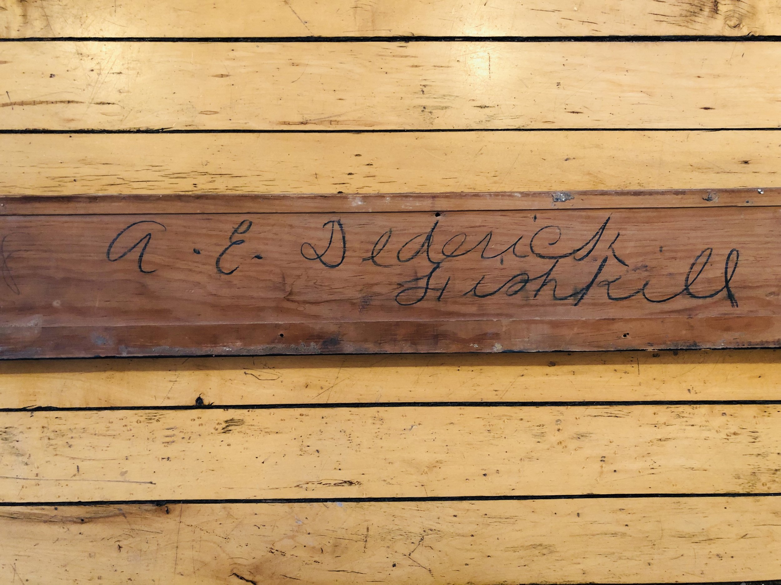
This is a photo of an original plank of wood that served as the architect’s signature that Deborah discovered while she was renovating the Telephone Building.   

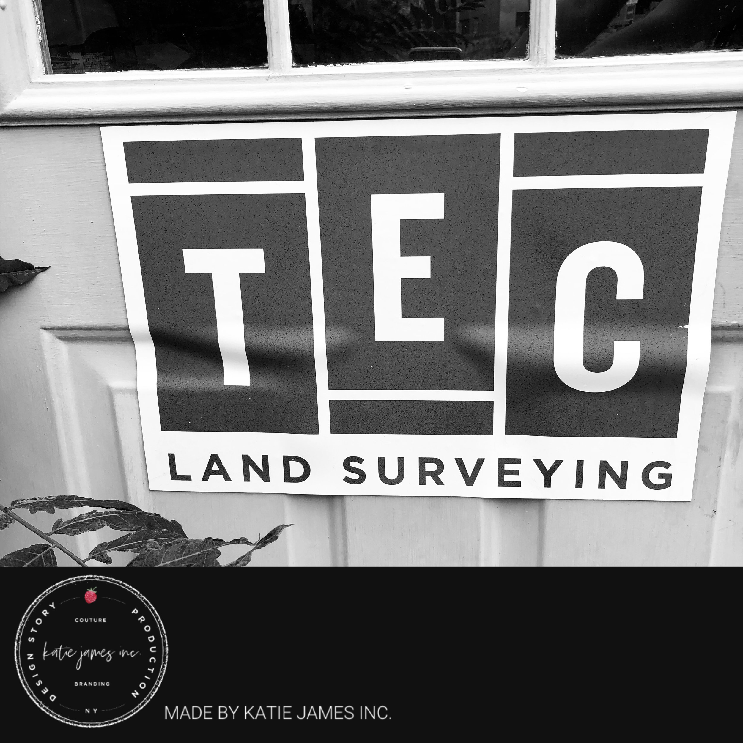
Logo Spotted! TEC Land Surveying Prints Sticker for Door

It’s exciting to see when a design client of Katie James Inc. uses the artwork and files we made for them to produce anything they want. Spotted this door sticker yesterday on TEC Land Surveying’s door. You should see their trucks!


Logo Design by @leighbemuse for #katiejamesinc

IMG_0680.PNG

Tales from the Depths of Picking a Domain Name - After a Cease and Desist Letter

domain-name-ideas-daisy-and-clipboard.jpg

I've been through the wringer a couple of times when naming a business and picking a domain name. Seriously, I think I've done it 7 or 17 times. For Tin Shingle, it resulted in a major company mailing us a cease and desist letter when our trademark application was days away from being approved. It was during the Publication phase, where companies have 30 days to challenge you. And challenge us they did.

We fought it for a year, and then gave up an settled. But going through the rebrand process was actually a great experience that resulted in one of my best names for a business: Tin Shingle.

I published three tips here in Tin Shingle's Tips section, so go check those out. But here are a few more inspirations behind the name:

  • Signal to the Artists: Marketing is a business thing, and artists don't usually think of it as a priority. Additionally, I wanted to attract makers at the early stages of their careers. To get with Tin Shingle early and propel their brands.
  • Work with my hands: I crave building things and working with my hands. I don't do it so often, but I dream to. Most of what I do is in the digital space, so having a business name that implied something physical was important to me.
  • Have it be totally, totally unique. I stress this in the Tips article, but I'm saying it again. Please. Don't remove one word to make your business name different from a similar business name. Just think of something different. You risk handing all of the earnings from your marketing efforts to your competitor!

Glamour Shots Now Available - Social Media Photography for Your Business

Let's be real - the photos you see in Instagram make you so overcome with emotion for wanting to go somewhere or eat something or experience that experience - that your behavior is actually altered by what you see in social media.

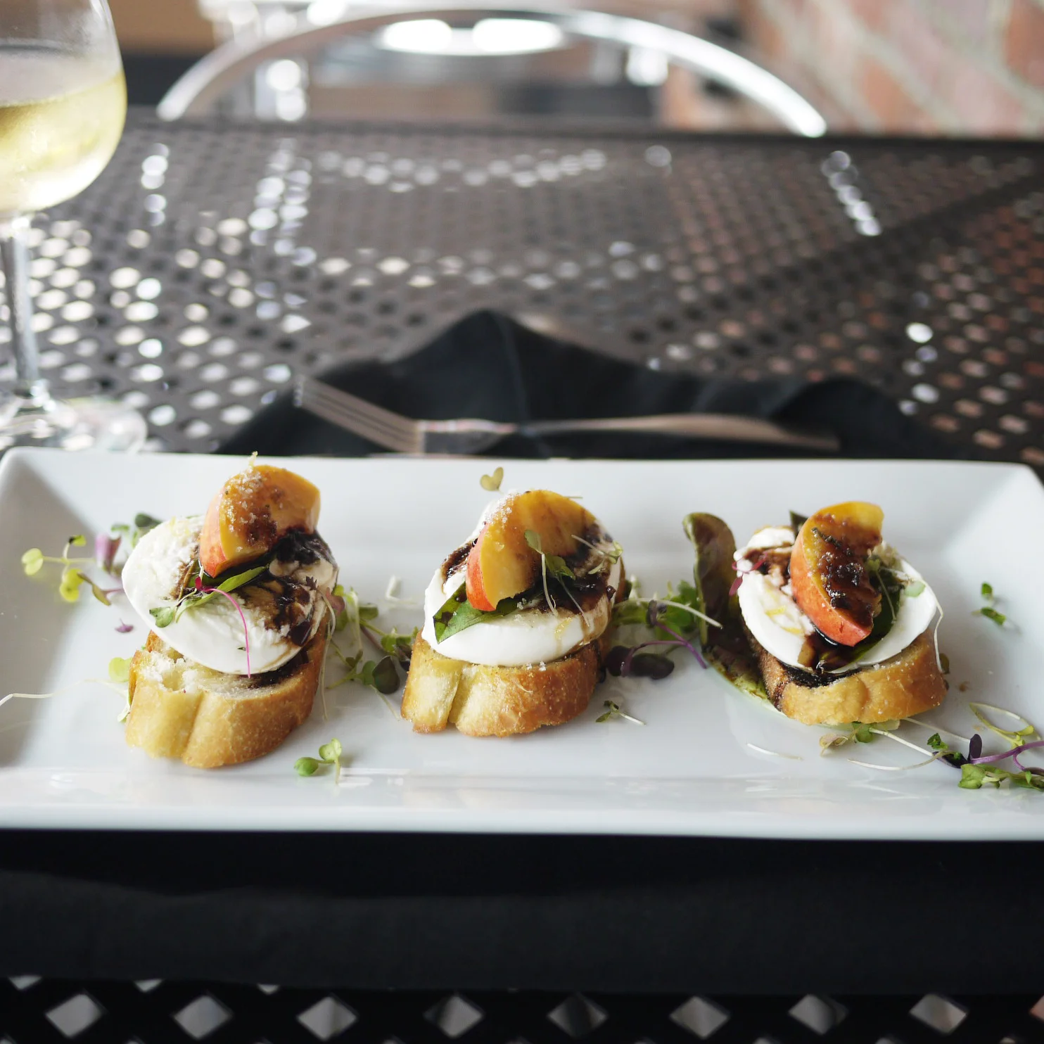
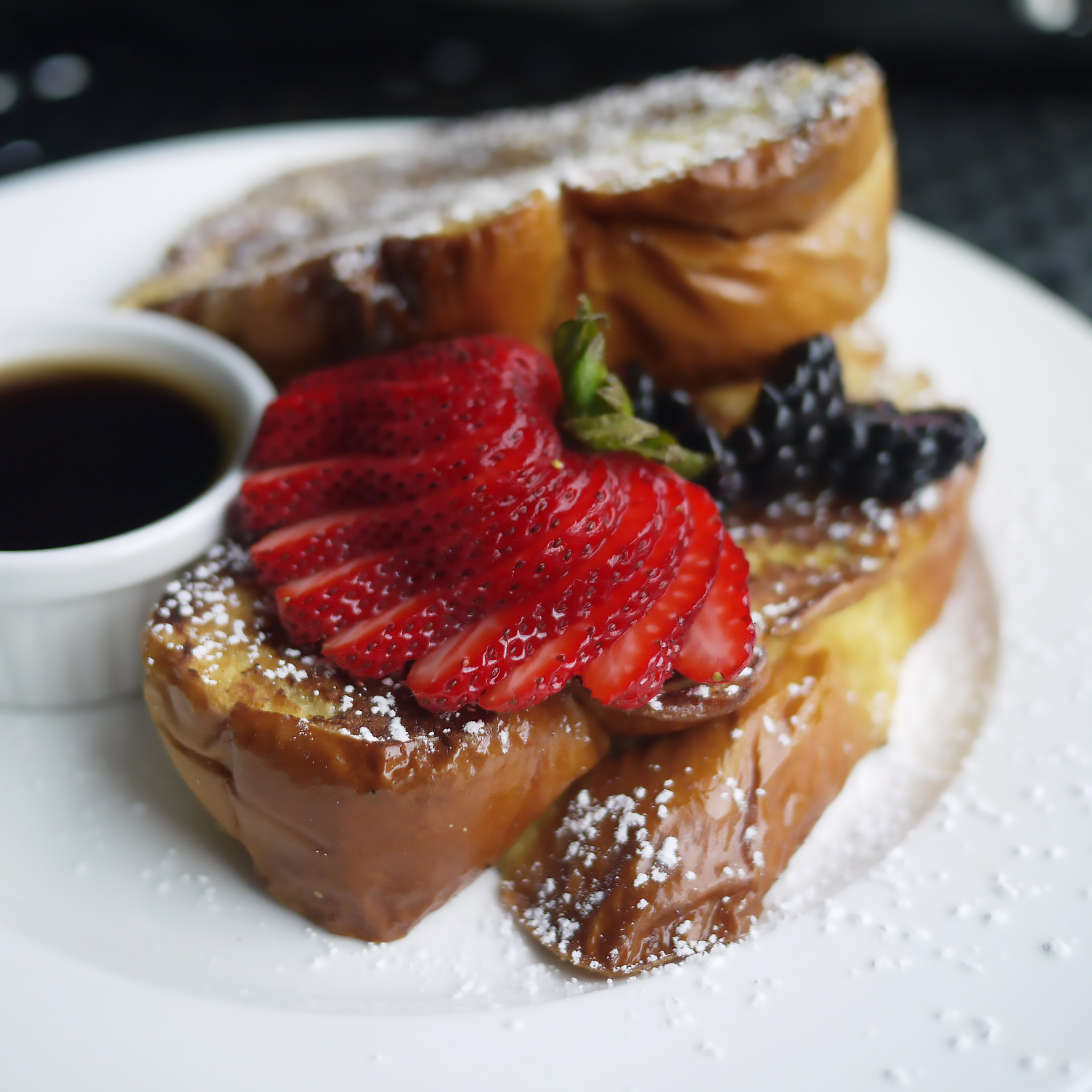
We want to help your business have this feeling on your new and current customers. Leigh Baumann is our photographer who we use for A Little Beacon Blog's advertising clients, and she can be used in your store or office also. Check out a few of the photos we produced for advertising clients below, and then book us for a photo session at your place.

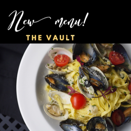
Case Study: Social Media Photography for The Vault Restaurant


Running your own social media for your business is important, as it captures your voice, your vibe, and your passion for your business. Showing this energy is important. But what do your photos look like? How are you translating your vision?

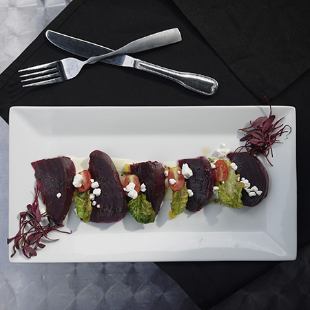
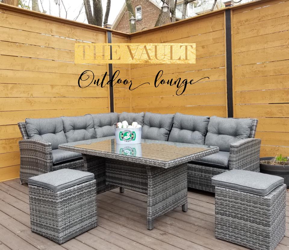
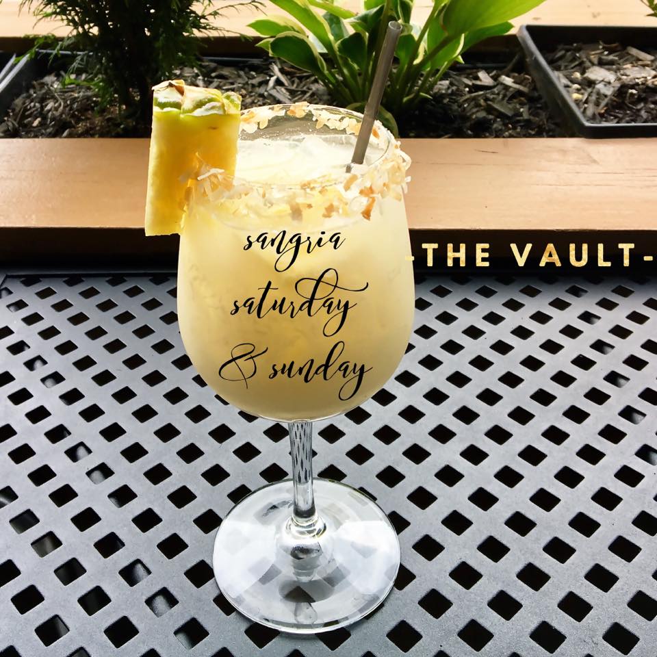
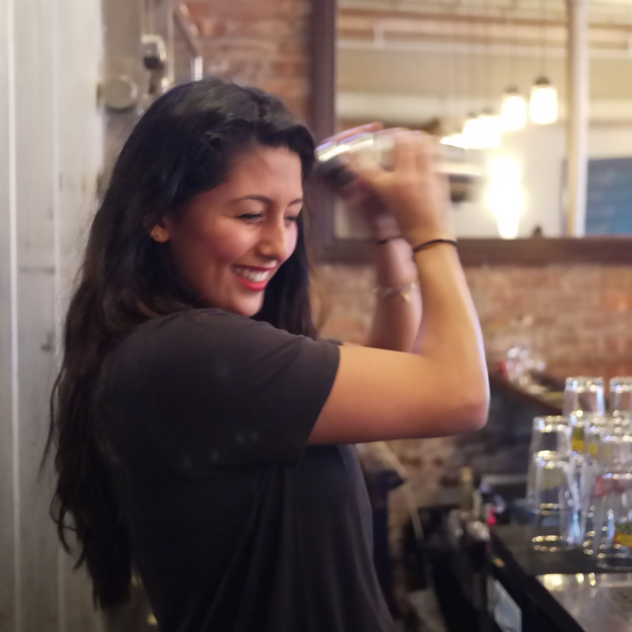
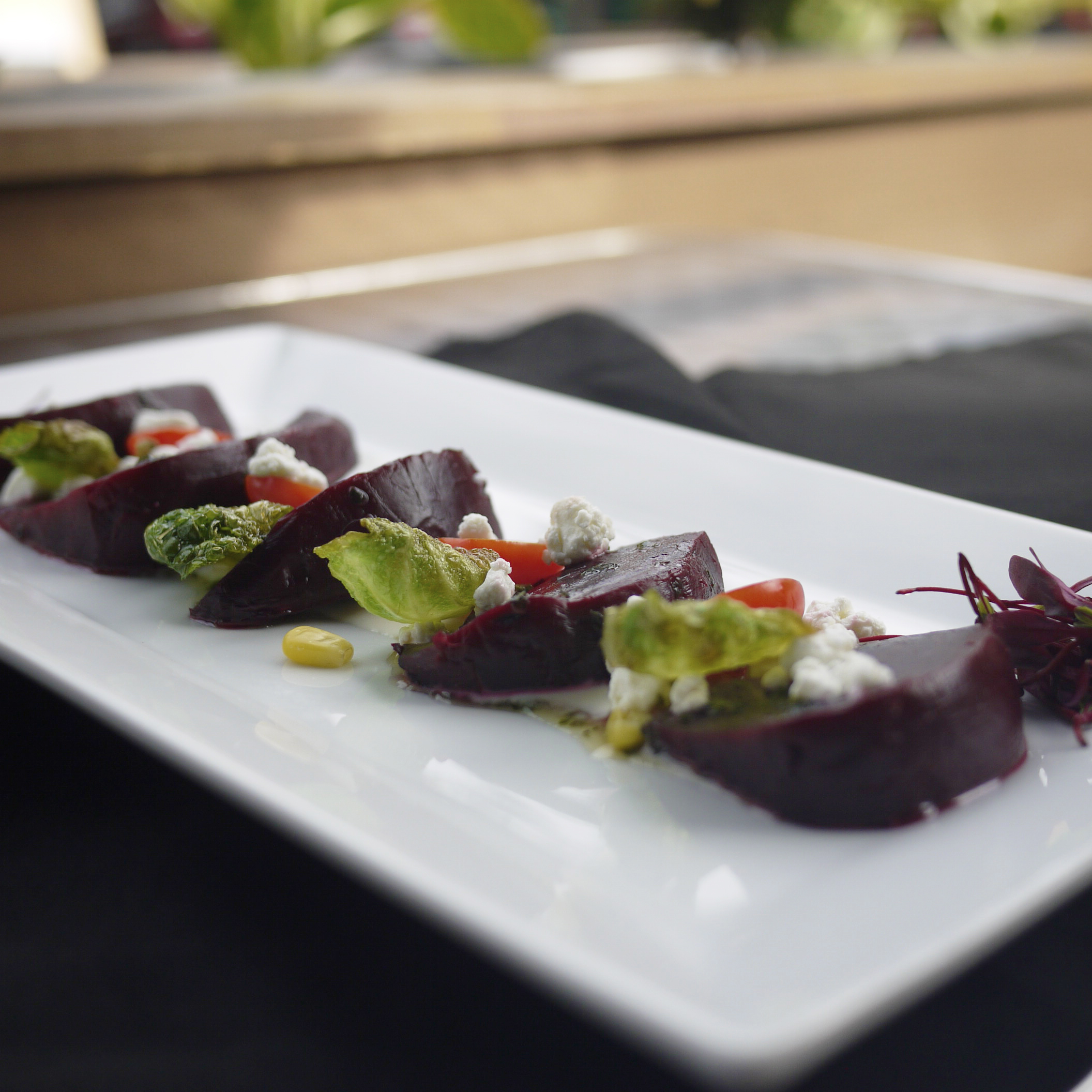
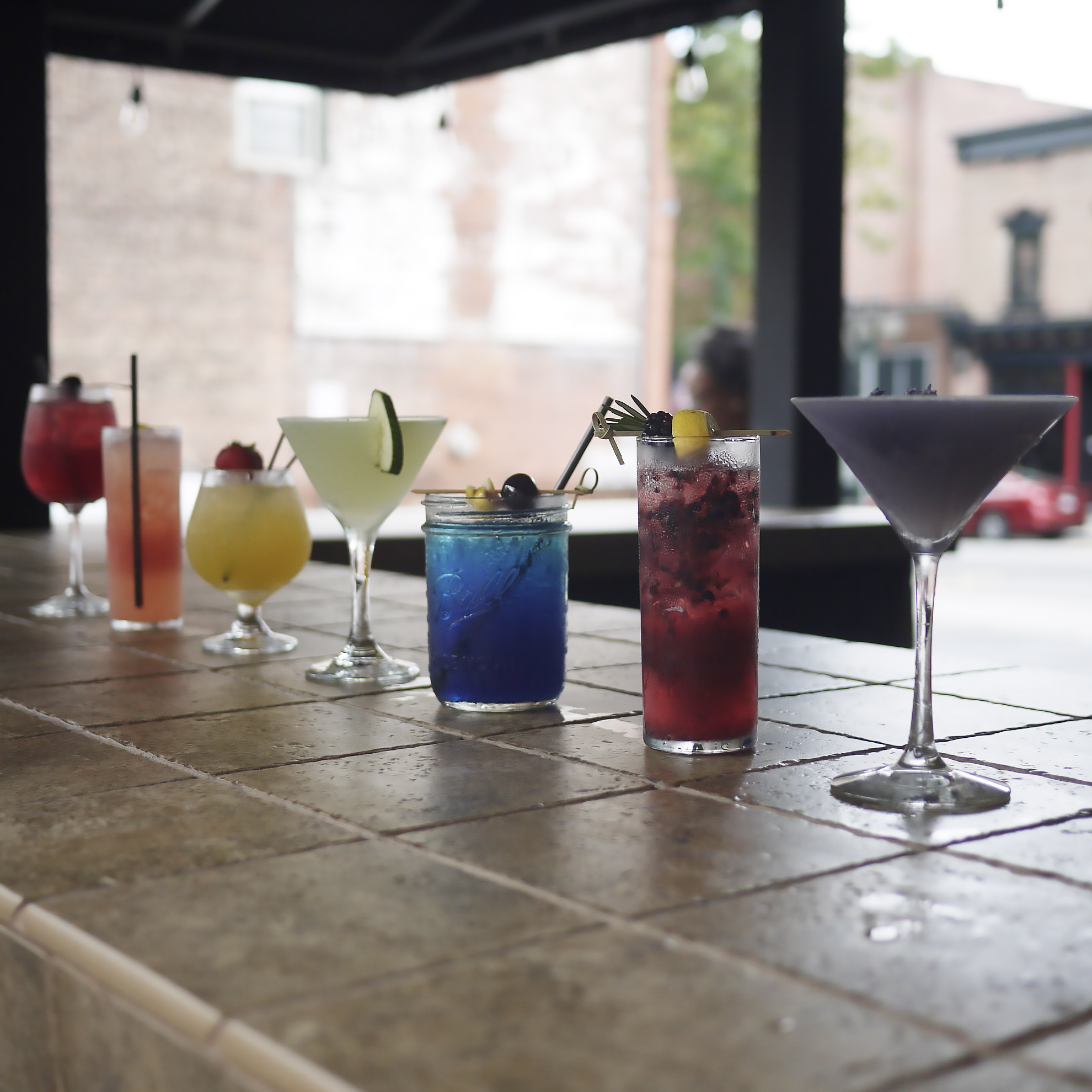
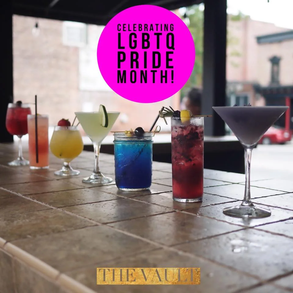
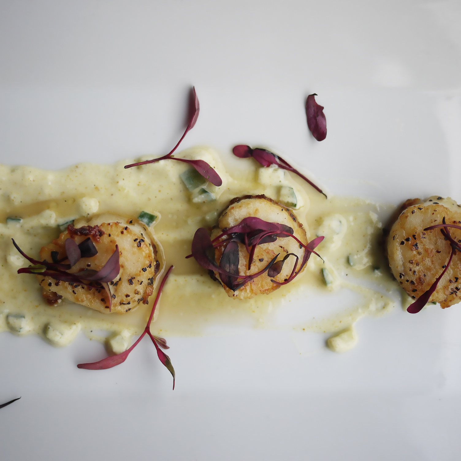
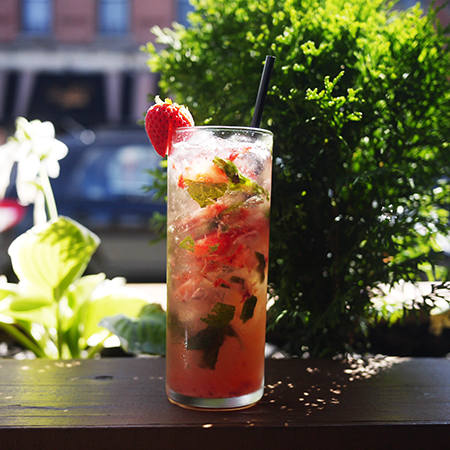
InHouse Design Media ghost-posted The Vault's social media until their owner and highly engaged staff grew comfortable and confident enough to take it over. In that time, we not only took food and drink photography, but we dressed the photos with strategic copy to really hammer home what the photo was about.

We didn't just take an amazing photo of a pina colada sangria, but we dressed it with a script font that let the viewer know that there is a sangria special every Saturday and Sunday. The engagement on the post and on other photos we dressed like that was successful. We happily watched people tag each other to make dates in to dine or drink at The Vault later.

InHouse Design Media can be hired to take photos like this for your business. Because we are local, we can only do this for clients local to Beacon, NY. We love traveling, but we're staying close to home!

Interested? Contact Us >

Launched! The Telephone Building at 291 Main Street

Deborah Bigelow is the modest owner of one the historic buildings in Beacon, NY. She is a guilder by trade, and a master renovator. But she's inside or outside of the building most of the time, restoring it, cleaning it, protecting it, and nurturing her tenets.

Most people who drive by the building or might need it for some reason don't realize that it's Deborah's hand who maintains it. IN 2017, she decided to put The Telephone Building on the map - the digital map - and give it a digital footprint, in addition to the parcel spot it occupies at 291 Main Street in Beacon, NY.

Deborah is also our landlord! And she's one of the best in Beacon. I was happy and honored when she asked if InHouse Design Media could design her first website. The first version of her website was launched in June 2017. She has big plans, but wanted to get a placeholder page up that presented the building, and had a contact form for people to reach her with building inquiries.

More About The Project

The Telephone Building

www.telephonebuildingbeacon.com

Launched: June 2017

Deborah Bigelow is a restoration artist who works within her company Gilded Twig. Gilding in gold is her specialty. Little known is her business of owning and restoring a building. In the late 1990s, Deborah bought a building at 291 Main Street that was an original Telephone Building built in 1907. This building became her artistic project, and she has restored all of it. The building's offices are rented out to different tenants. In 2017, Deborah was ready to brand the building and her second business, 291 Main Street LLC. 

Special Features

  • The website is on one page, which is essentially a Cover Page. While we did not use the actual Cover Page tool in Squarespace, the effect is the same, yet with more depth.
  • The website can easily be expanded with more pages and photos when the client is ready.

If This Little One Can Jump Into Squarespace...

IMG_2058.JPG

The littlest one on the team...she wanted to "hang out" tonight after watching her shows, so she got to finish setting up an intake form for our client Gilded Twig who is launching a website for her business, The Telephone Building. The building and the work she has done to it is getting its own website. Reveal to come!


Point of this photo is, if little Ruby can eagerly jump into a webpage in Squarespace to want to know how to set it up, so can you! Just double tap and drag. Have your audience in mind of how easily you want them to see it and experience something. If Squarespace still stumps you, or if organizing and presenting your website as a whole remains overwhelming to you, thus stopping you from creating this big impact on the web, then contact us. We can train you or do it for you with your guidance. Every project is  different, and we enjoy getting to know your brand.

Flyer 3-Pack for Valentine's Day Pop-Up Event: Paper, Facebook, Banner Ad

Paper flyers are one of the most important aspects to promoting an in-person event locally. However, with advertising promotions and free promotions via Facebook Event Pages, you'll need variations of the flyer to be similar in order to cross-promote your event. Key to this is making sure all of the imagery has the same look and feel. Even putting your flyer up on the door of where the event is is an important but sometimes overlooked move made by event hosts, and can cost the event a few people as they walk by a flyer-less door, oblivious to the fact that an event they'd seen around town is going on now - today - right here!
For the pop-up shop at A Little Beacon Blog, A Lovely Little Pop-Up, we started with the design of the paper flyer, 8.5"x11", which will be printed on regular paper at a local printer, with no bleed, so there will be a white border around it. Keeping the costs down. If we had a color laser printer in the office, we'd print it on that.

Next comes the Facebook event cover art. If people are seeing it around town, they want to recognize it on the official Facebook event page too! Important to us is making sure the day and time pop on all versions.

And finally, the banner ad size. In most cases, this will be the smallest design that may get the most visibility because of its placement in a media outlet. Even though the artists are important to this event, the date and time are crucial, so we made sure to make them pop. We changed the font to a more basic font that anyone can read while skimming quickly through other ads.

Of course, the hero image that remained consistent on all visuals is the red hearts. You can't miss this, even with your glasses off!

Cyber Monday Sale: 20% Off Digital Marketing and Website Design

Last day for our Cyber Monday sale on Website Design + Digital Marketing Services. This sale never happens, so here are the details that are good until midnight tonight:

PERSONAL TRAINING: 20% Off any already discounted package. Katie can help you plot out your website, make your social streams look good and be compelling, understand SEO, help you with your blog ideas to attract people from Google and shop from you (even if you sell time/services), etc.
Details and Buy Here (prices slashed, no coupon necessary)

WEBSITE DESIGN: 20% Off the First Time Website Design Package. Great for brochure websites, and even with light ecommerce. Those of you selling services, Katie can help you think up packages that can be purchased online, or ways to skip the invoicing step.
Details and Buy Here (prices slashed, no coupon necessary)

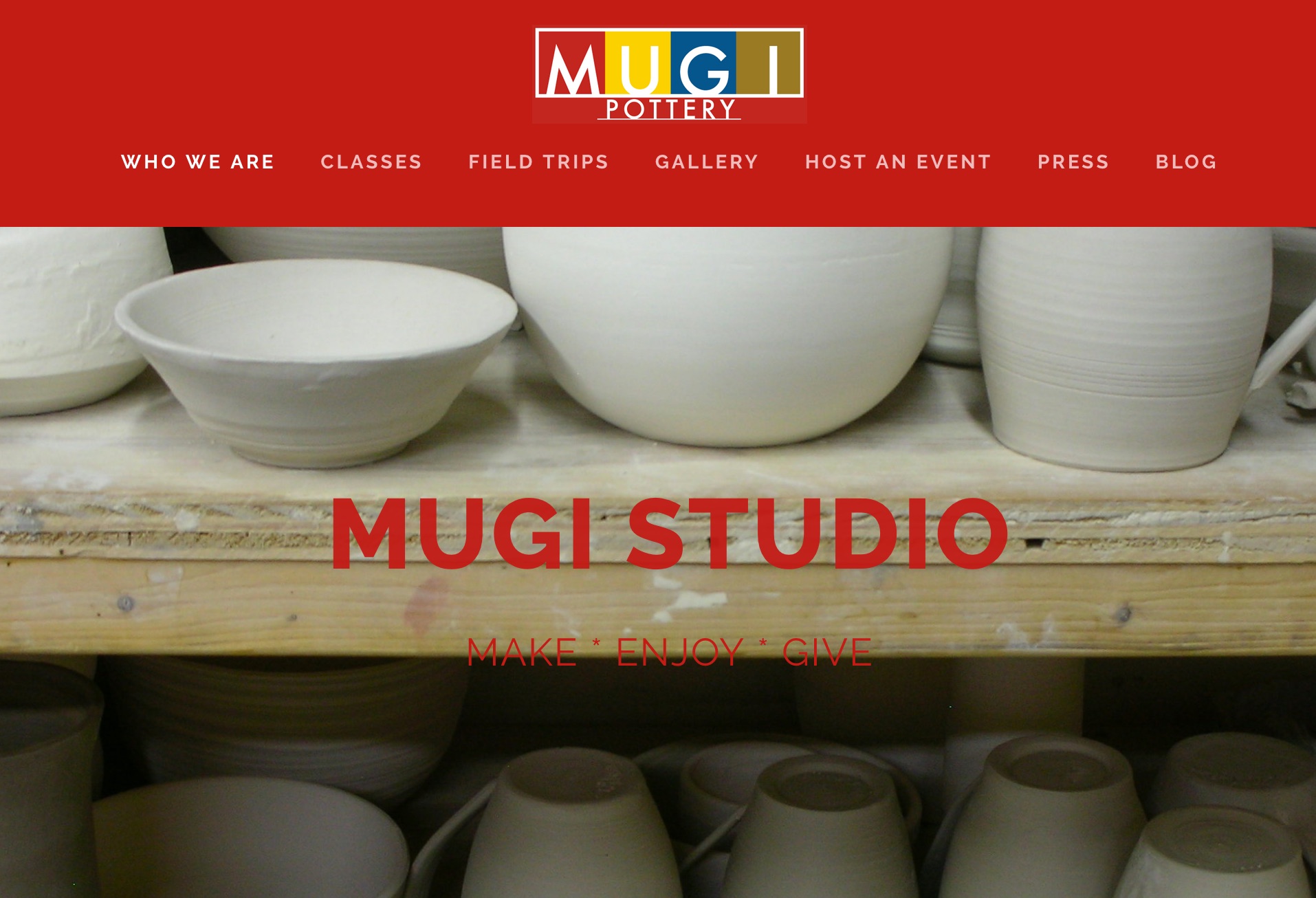
Website Launch! Mugi Pottery Redesign in Squarespace

Feeling super proud of the new website redesign for Mugi Pottery, an interactive pottery studio in Manhattan's Upper West Side.

After designer/producer Katie took pottery classes there many years ago - before the iPhone existed! - Mugi Pottery became a website client. We first housed their website in Joomla, then in Drupal, and now in Squarespace.

Putting this website together for them was such a pleasure. Favorite parts?

  • That more photos and galleries are so much easier now.
  • The SUPER EASY "Blocks" that Squarespace makes available that we can use as call to action buttons, without designing a color graphic! Now their ecommerce is real easy to lay out.
  • The Teachers have their own page of bios so that web visitors can see who really makes up Mugi Pottery.
  • Mugi had been busting out of their top navigation. While it had been pretty to look at, the dual-side bar of the previous design was cumbersome and costly to widen. But now...

Ecommerce Option

Owner Outi Putkonen elected to use Ocassion to handle their class registrations, workshops, and one-off classes. While Squarespace could have handled this, Ocassion is simple to use. Using Squarespaces "Block" was easy enough to mimic a checkout button.

More Digital! Bigger Footprint

Outi is unleashed, and not only has she fired up their Instagram feed, but she has a YouTube channel as well. Thanks to Squarespace's drag n drop Video feature, adding those videos will be very easy. Take a visit, and if you're in NYC, do stop into their Upper West Side studio on Amsterdam and W. 108th. Tell them Katie said hi :)